

Undergraduate Certificate in Creating Interactive Data Visualizations with Python
Earn an Undergraduate Certificate in creating interactive data visualizations using Python, enhancing analytical skills and data storytelling abilities.
Undergraduate Certificate in Creating Interactive Data Visualizations with Python
Programme Overview
This course is designed for undergraduate students and professionals interested in data science, web development, and data analytics. It equips learners with essential skills in creating interactive data visualizations using Python, focusing on libraries like Matplotlib, Seaborn, and Plotly. Students will gain proficiency in handling data, crafting compelling visual representations, and deploying these visualizations on the web.
By the end of the course, participants will be able to analyze complex datasets, create dynamic and interactive visualizations, and communicate insights effectively through web-based tools. Practical projects and real-world case studies ensure learners apply their knowledge in authentic scenarios, preparing them for careers in data visualization and related fields.
What You'll Learn
Dive into the world of visual storytelling with our Undergraduate Certificate in Creating Interactive Data Visualizations with Python. This intensive, hands-on program equips you with the skills to transform complex data into compelling, interactive visual narratives. You'll master Python, a powerful tool for data analysis and visualization, and learn to create dynamic, engaging dashboards that can captivate and inform. Whether you're aiming to enhance your data science portfolio, seek roles in tech, finance, or marketing, or simply want to decode data like a pro, this certificate is your ticket. Join us to turn numbers into narratives and stand out in today's data-driven job market.
Programme Highlights
Industry-Aligned Curriculum
Developed with industry leaders to ensure practical, job-ready skills valued by employers worldwide.
Globally Recognised Certificate
Recognised by employers across 180+ countries as a mark of professional excellence.
Flexible Online Learning
Study at your own pace with lifetime access to all course materials and updates.
Instant Access
Start learning immediately — no application process or waiting period required.
Constantly Updated Content
Stay ahead with the latest industry trends, best practices, and emerging insights.
Career Advancement
87% of graduates report measurable career progression within 6 months of completion.
Topics Covered
- 1. Introduction to Data Visualization with Python: Learners will explore the basics of data visualization, focusing on Python libraries such as Matplotlib and Seaborn. They will gain foundational skills in creating static visualizations and understanding data representation.
- 2. Interactive Data Visualization with Plotly and Bokeh: This module introduces learners to interactive visualization techniques using Plotly and Bokeh. They will learn to create dynamic and interactive visualizations that respond to user inputs.
- 3. Data Manipulation with Pandas: Learners will master data manipulation techniques using the Pandas library, including data cleaning, filtering, and transformation. Practical skills in preparing data for visualization will be developed.
- 4. Geospatial Data Visualization: This module covers the visualization of geospatial data using libraries like GeoPandas and Folium. Learners will create maps and explore geospatial analysis concepts.
- 5. Time Series Visualization: Learners will study how to visualize time series data effectively, using techniques like line plots, area plots, and rolling mean calculations. Practical skills in analyzing and visualizing temporal data will be enhanced.
- 6. Advanced Plotting with Matplotlib: This module delves into advanced plotting techniques with Matplotlib, including customizing plots, creating subplots, and using advanced features like annotations and legends.
- 7. Creating Dashboards with Plotly Dash: Learners will learn to create interactive dashboards using Plotly Dash, a Python framework for building analytical web applications. They will develop skills in integrating multiple visualizations into a cohesive dashboard.
- 8. Data Visualization Best Practices: In this module, learners will understand best practices for creating effective and accessible data visualizations. Topics include color theory, accessibility considerations, and storytelling through data.
- 9. Advanced Topics in Data Visualization: This module explores advanced topics such as network visualization, parallel coordinates, and multidimensional scaling. Learners will gain insights into visualizing complex data relationships and structures.
- 10. Final Project: Interactive Data Visualization Case Study: Learners will apply their knowledge by creating an interactive data visualization project that addresses a real-world problem. This project will integrate skills learned throughout the certificate program.
What You Get When You Enroll
Secure checkout • Instant access • Certificate included
Key Facts
Audience: Data enthusiasts, programmers, analysts
Prerequisites: Basic Python knowledge, data handling
Outcomes: Create interactive visualizations, use Python libraries
Ready to get started?
Join thousands of professionals who already took the next step. Enroll now and get instant access.
Enroll Now — $99Why This Course
Gain specialized skills in data visualization, a high-demand skill in analytics and tech industries.
Learn to create interactive visualizations using Python, a versatile language valued in many tech roles.
Enhance your resume and open doors to career opportunities in data science, analytics, and software development.
Your Path to Certification
Trusted by Professionals Worldwide
Course Brochure
Download our comprehensive course brochure with all details
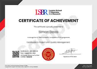
Sample Certificate
Preview the certificate you'll receive upon successful completion of this program.
Get Free Course Info
Enter your details and we'll send you a comprehensive course information pack straight to your inbox.
Employer Sponsored Training
Let your employer invest in your professional development. Request a corporate invoice and get your training funded.
Request Corporate InvoiceWhat People Say About Us
Hear from our students about their experience with the Undergraduate Certificate in Creating Interactive Data Visualizations with Python at FlexiCourses.
Oliver Davies
United Kingdom"The course provided high-quality, detailed material that significantly enhanced my ability to create interactive data visualizations using Python, which has been incredibly beneficial for my career in data analysis. I gained practical skills that I can immediately apply to real-world projects, making the learning experience both valuable and rewarding."
Klaus Mueller
Germany"This course has been instrumental in enhancing my ability to create interactive data visualizations, which is highly valued in the tech industry. It not only taught me essential Python skills but also showed me how to apply them practically, making me more competitive in my job search."
Klaus Mueller
Germany"The course structure was well-organized, providing a clear path from basic Python syntax to advanced data visualization techniques, which greatly enhanced my understanding and practical skills in creating interactive visualizations. The comprehensive content and real-world applications have been invaluable for my professional growth in data analysis and presentation."